DesmoidTumorManagement.de — Component Inventory
WordPress / Elementor → AEM / EDS · 11 pages analyzed · 7 composite · 5 standalone · 0 structural
7
Composite
5
Standalone
0
Structural
12
Total Types
139
Total Instances
1. Classification Legend
Components on desmoidtumormanagement.de are organized into a two-tier model based on their role and composition.
Composites are multi-part containers that hold atoms inside. Standalone components are atomic building blocks.
This hierarchy maps directly to the AEM/EDS component model — composites become container components,
standalone components become the drag-and-drop building blocks.
1 Composite Components
Multi-part containers that hold atoms inside. Each composite has defined internal anatomy and may have variants.
Has anatomyYes — dissected into child atoms
VariantsSome composites have multiple visual/functional variants
EDS mappingBlock with structured content model
2 Standalone Components
Atomic building blocks — the smallest reusable UI elements. They appear independently on the page.
Has anatomyMinimal — they are leaf-level components
EDS mappingCore EDS block or simple custom block
2. Composite Components
Multi-part containers that hold atoms inside. Each has defined internal anatomy and variants.
| Component | Variants | Atoms | Anatomy |
|---|---|---|---|
| banner
Full-width promotional section with background image and overlay card containing title, text, and redirect link/button. Used for CTAs linking to other sections (e.g. Service-Materialien)
2 instances · 2 pages |
— | image heading text button | 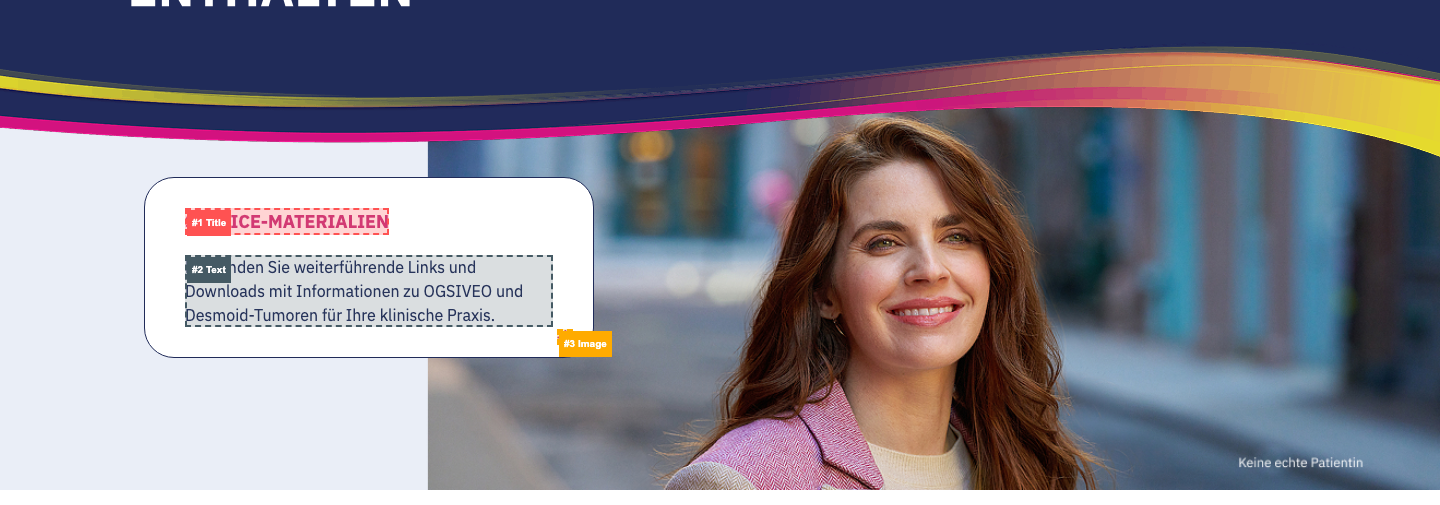 |
| card
Grouped informational cards presented side by side. Mostly presentational, some variants have external redirects
8 instances · 6 pages | default Title + content (text, list, or icon+text). Cards have color accents — either colored bottom borders (pink, blue, yellow) or gradient top border (navy → purple → pink). Content varies (icons, bullet lists, paragraphs) but structure is the same | image heading text list | 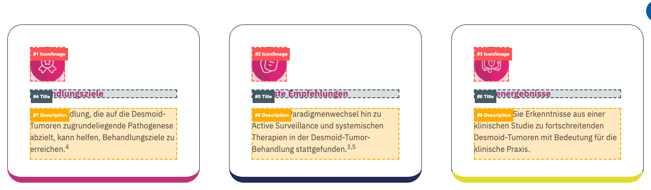 |
| redirect Image + heading + text underneath with card styling (rounded corners, shadow). Clickable images trigger external link overlay ('You are now leaving' confirmation). Used for visual content like anatomical illustrations | image heading text link | 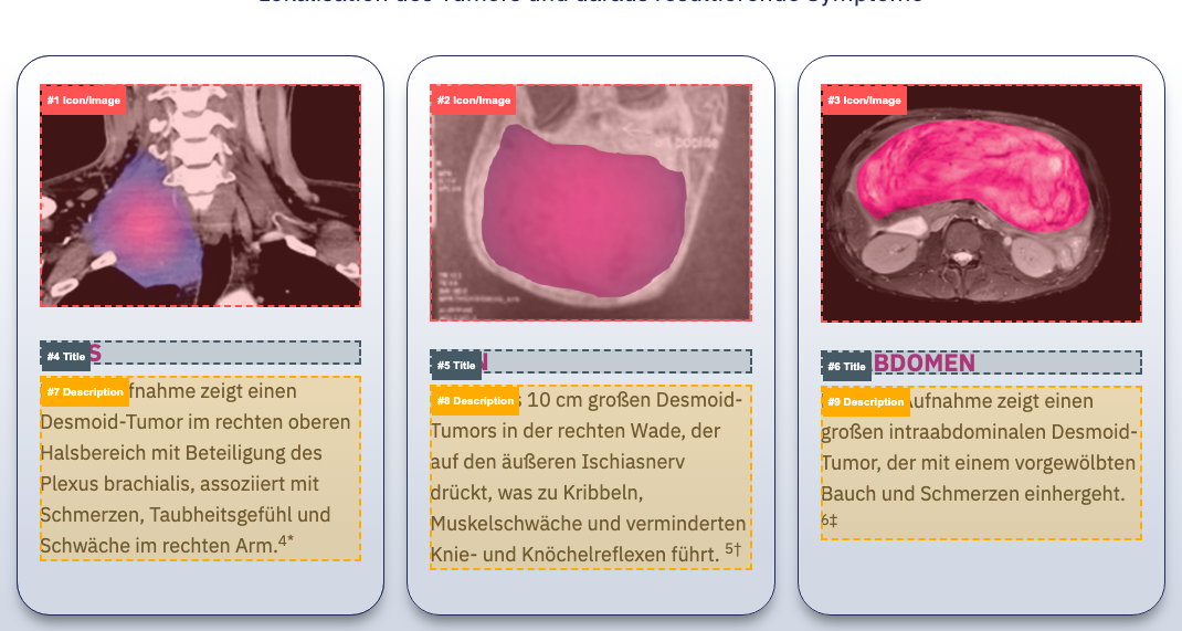 | |
| form
Form component with input fields, submit button, and supporting content
4 instances · 4 pages | login DocCheck HCP authentication form with username/password fields, submit button, forgot password link, and registration CTA. Header has gradient styling (navy → purple → pink) | image heading text button link | 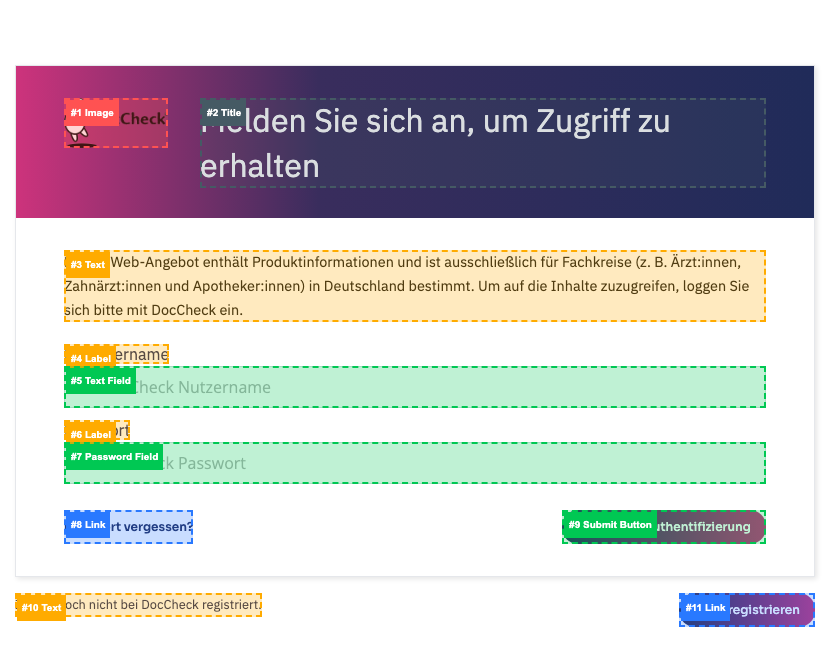 |
| newsletter Newsletter/updates signup form with email field and submit button | heading text button | 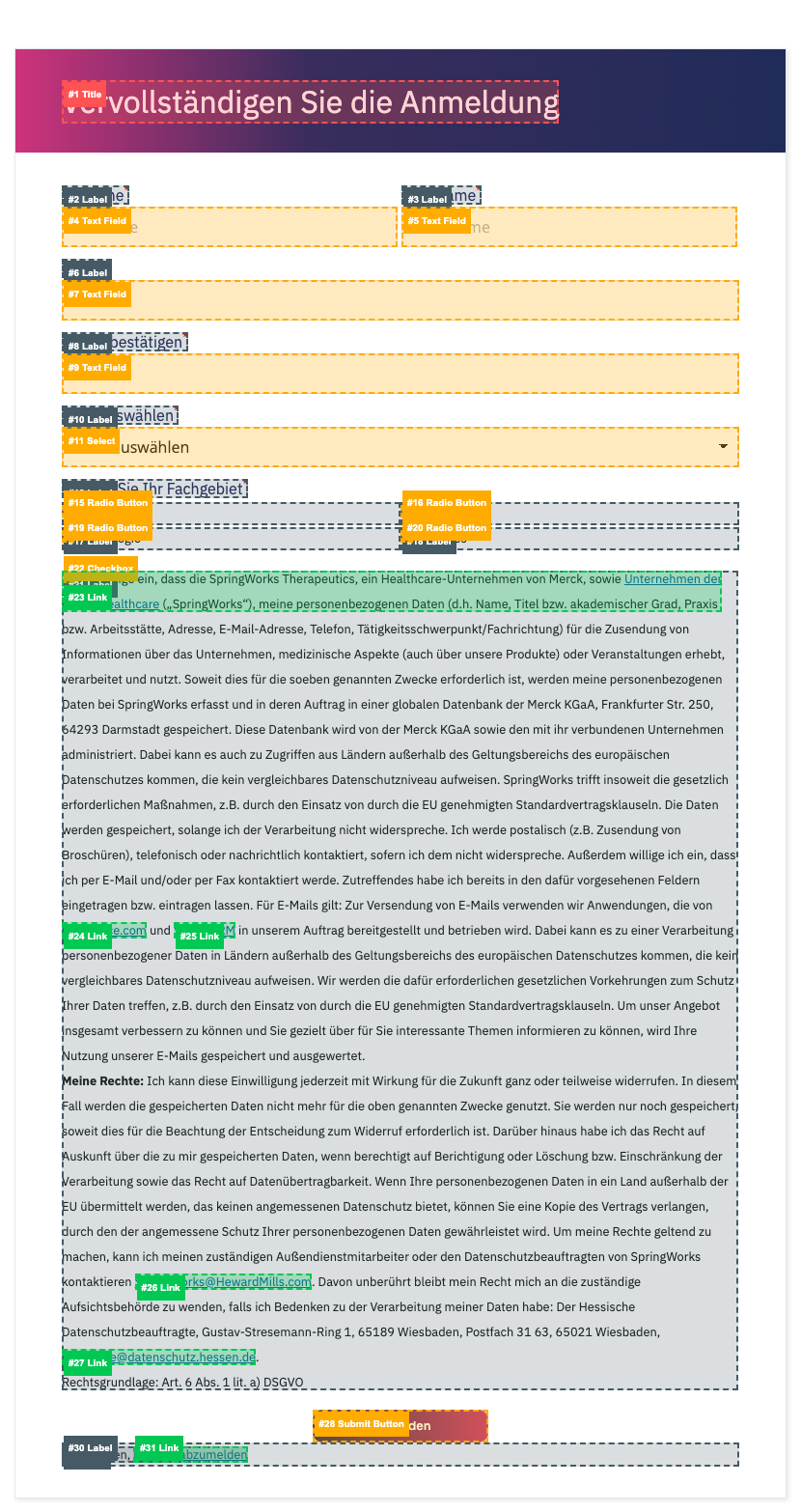 | |
| hero-section
Full-width hero banner with background image, heading, and optional content overlays
10 instances · 10 pages | default Basic hero with background image, title (H1), and optional text overlay | image heading text | 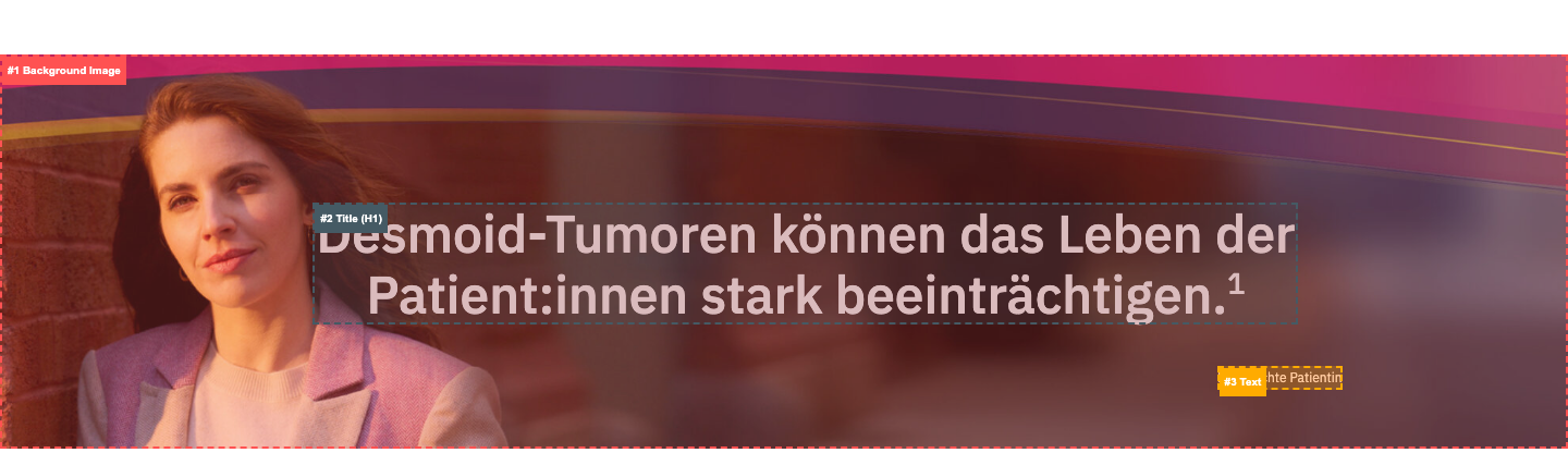 |
| with-anchors Hero with in-page anchor navigation links below the title, acting as section jump points | image heading text link | 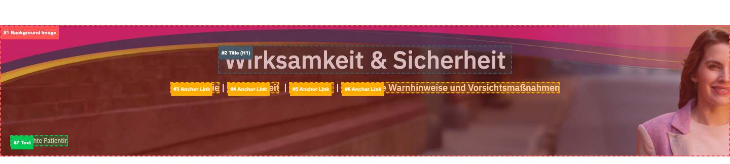 | |
| icon-grid
Row of icons with text labels underneath. No card styling — plain layout of icon+text pairs in a grid/row
4 instances · 3 pages |
— | image text | 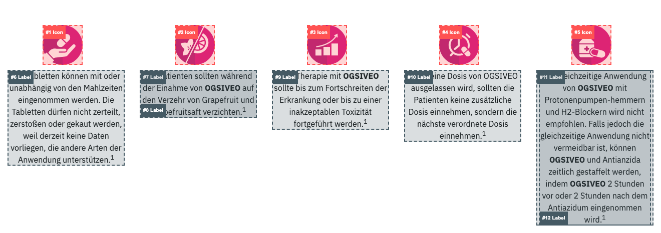 |
| infographic
Large data visualization panel with charts (donut/circular), percentages, statistics, and labels. Styled with card-like borders. Used for presenting clinical study data and patient demographics
2 instances · 1 pages |
— | image heading text | 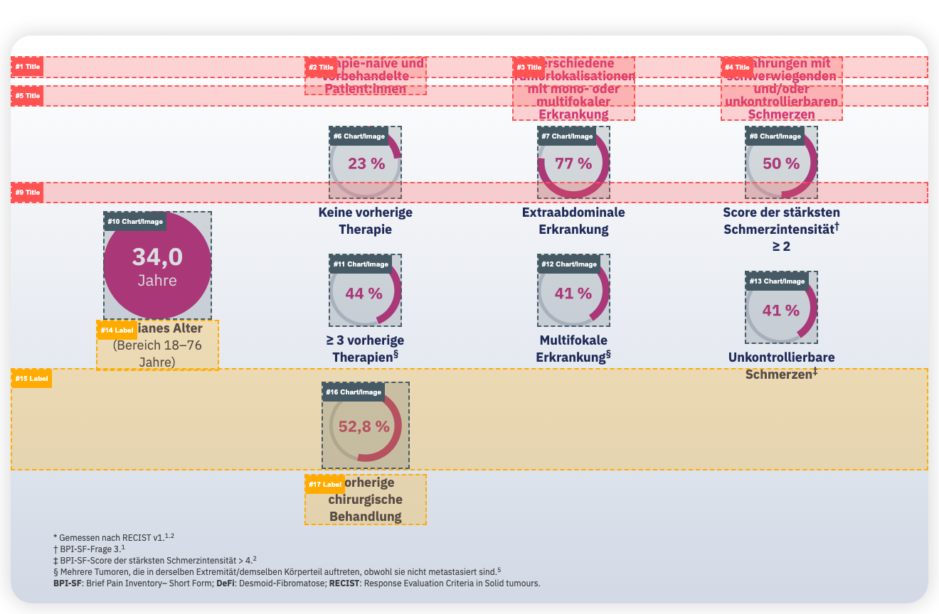 |
| tabs
Tabbed content component with clickable tab headers that switch between content panels. Used for presenting related data sets (e.g. efficacy endpoints)
1 instances · 1 pages |
— | heading text image | 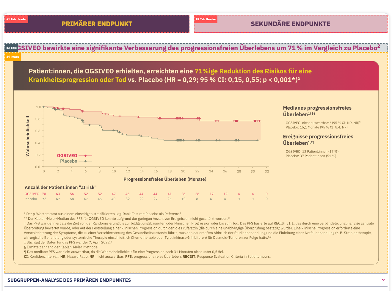 |
3. Standalone Components
Atomic building blocks — the smallest reusable UI elements.
| Component | Instances | Pages | Anatomy |
|---|---|---|---|
| accordion
Expandable/collapsible panel. Used for references section
11 instances · 7 pages |
11 | 7 |  |
| button
CTA button with link
6 instances · 6 pages |
6 | 6 |  |
| heading
Standalone heading element (H1-H4). In EDS these are separate components from text blocks
47 instances · 10 pages |
47 | 10 |  |
| image
Standalone image element
10 instances · 5 pages |
10 | 5 | 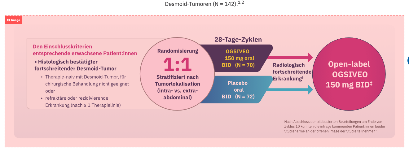 |
| text-block
Rich text content block with paragraphs, lists, and inline links
34 instances · 8 pages |
34 | 8 |  |
4. Analyzed Pages
Each page links to its individual review page with annotated screenshots.
| Page | Template | Total | Components |
|---|---|---|---|
| anmeldung | landing | 1 | form |
| dosierung-und-anwendung | content | 15 | accordion banner button heading hero-section icon-grid image text-block |
| fuer-updates-anmelden | landing | 4 | form heading hero-section text-block |
| home | landing | 12 | accordion banner button card heading hero-section image text-block |
| home-prelogin | landing | 6 | accordion card form heading hero-section |
| kontakt | contact | 10 | heading hero-section text-block |
| service-materialien | content | 14 | button card heading hero-section icon-grid text-block |
| splash-page | landing | 6 | accordion card form heading hero-section |
| ueber-desmoid-tumoren | content | 31 | accordion button card heading hero-section icon-grid image text-block |
| ueber-ogsiveo | content | 13 | accordion button heading hero-section image text-block |
| wirksamkeit-und-sicherheit | content | 27 | accordion button card heading hero-section image infographic tabs text-block |
5. Template × Component Matrix
Which component types appear in which templates.
| Template | accordion | banner | button | card | form | heading | hero-section | icon-grid | image | infographic | tabs | text-block |
|---|---|---|---|---|---|---|---|---|---|---|---|---|
| contact (1) | — | — | — | — | — | 3 | 1 | — | — | — | — | 6 |
| content (5) | 8 | 1 | 5 | 5 | — | 36 | 5 | 4 | 7 | 2 | 1 | 26 |
| landing (5) | 3 | 1 | 1 | 3 | 4 | 8 | 4 | — | 3 | — | — | 2 |