DesmoidTumorManagement.de — Component Mapping
| Status | Description |
|---|---|
| Match | Site component maps directly to an EDS block. Ready to author. |
| Indirect | EDS block exists but needs adaptation — CSS fix, block extension, or split into multiple blocks. |
| Gap | No EDS block available. Needs custom development or content workaround. |
Overview
| Site Component | EDS Block | Status | Pages |
|---|---|---|---|
hero-section [default] | hero | Match | 8 of 11 |
hero-section [with-anchors] | hero + link-list | Indirect | 4 of 11 |
heading | Default content | Match | All 11 |
text-block | Default content | Match | All 11 |
image | Default content | Match | 6 of 11 |
button | Default content | Match | 5 of 11 |
card [default] | cards | Match | 6 of 11 |
card [redirect] | teaser | Match | 2 of 11 |
accordion | accordion | Match | All 11 |
form [newsletter] | contact-form | Match | 1 of 11 |
form [login] | contact-form | Indirect | 4 of 11 |
banner | Custom block needed | Gap | 2 of 11 |
icon-grid | columns | Indirect | 3 of 11 |
infographic | — | Gap | 1 of 11 |
tabs | — | Gap | 1 of 11 |
Component Details
hero-section → hero
Match
Full-width banner with background image and H1 heading. EDS auto-builds the hero when a <picture> precedes an <h1> in the first section.

home-prelogin — hero-section [default]
desmoidtumormanagement.de — Background image with H1 heading and disclaimer text overlay.

ueber-desmoid-tumoren — hero-section [with-anchors]
Same hero plus anchor navigation links. In EDS: hero block + link-list block.
EDS Block: Hero
Uses the Hero block from the EDS UI Kit. Editors place a background image and type the heading text — the layout is handled automatically. No manual configuration needed.
| What editors do | Result |
|---|---|
| Insert image | Becomes the full-width background |
| Type heading | Appears as white text overlay on the image |
- [default] variant: Direct match — image + heading, ready to use
- [with-anchors] variant: Hero block for the banner + separate Link List block for the anchor navigation below
- Minor CSS adjustment needed for the background image stacking — one-line fix in the hero block stylesheet
heading → Default content
Match
Headings are native EDS content — no block needed. Editors type them directly in the document.

dosierung-und-anwendung — heading (H2)
Live page — Standalone heading detected as a separate component from text blocks.

dosierung-und-anwendung — heading (H3)
Sub-section heading used for content structure.


EDS: Native default content
Headings are authored directly in the document — no block or configuration needed. EDS renders H1–H4 with the project's typography styles automatically.
| What editors do | Result |
|---|---|
| Type heading | Select heading level (H1–H4) in the document editor. Styling applied automatically. |
- Headings on the live site were detected as separate components (not merged with text) — maps cleanly to EDS default content
- Present on all 11 pages — most common component type
text-block → Default content
Match
Text blocks with paragraphs, lists, and inline links are native EDS content — authored directly in the document.

wirksamkeit-und-sicherheit — text-block
Live page — Rich text content with paragraphs, bold formatting, and footnote references.
EDS: Native default content
Paragraphs, bold text, links, and lists are authored directly in the document. EDS renders them with the project's typography and spacing.
| What editors do | Result |
|---|---|
| Type paragraphs | Body text with the project's font and spacing |
| Add links | Inline hyperlinks rendered with project link styles |
| Add lists | Bullet or numbered lists, styled automatically |
- Text content can be extracted from
anatomy/{component}/anatomy.json— each paragraph and list is captured with full text - Present on all 11 pages — second most common component type
image → Default content
Match
Images are native EDS content — editors insert them directly in the document.

wirksamkeit-und-sicherheit — image
Live page — DeFi study design diagram (SVG).
EDS: Native default content
Editors insert images directly in the document. EDS renders them responsively with optimized formats.
| What editors do | Result |
|---|---|
| Insert image | Drag or paste image into the document. SVG, PNG, JPG supported. |
| Alt text | Add descriptive alt text for accessibility. |
- Images from the live site can be downloaded and inserted into EDS documents
- SVG diagrams (like the study design) render at full quality in EDS
- Present on 6 of 11 pages
button → Default content
Match
Buttons are styled links in EDS — editors create them by bolding a link in the document.

dosierung-und-anwendung — button
Live page — CTA button linking to Service-Materialien.

EDS: Styled link
Editors create a link and make it bold — EDS automatically styles bold links as buttons.
| What editors do | Result |
|---|---|
| Add link | Type link text, select it, add URL |
| Make bold | Bold the link — EDS renders it as a styled button |
- In EDS,
<strong><a href="...">...</a></strong>renders as a button - Present on 5 of 11 pages — used for CTAs like "Über OGSIVEO >" and "Service-Materialien >"
card [default] → cards
Match
Grouped informational cards with icon, title, and description. Maps to the EDS cards block.

home-prelogin — card [default] (3 cards)
Live page — Three feature cards with icons, titles, and descriptions.

EDS Block: Cards
Uses the Cards block from the EDS UI Kit. Editors create a table with "Cards" as the block name. Each row becomes a card with image + text content.
| What editors do | Result |
|---|---|
| Create table | First row: "Cards". Each subsequent row = one card. |
| Add image | First cell: insert icon/image |
| Add content | Second cell: heading + description text |
- Icon images can be downloaded from the live site and inserted into card rows
- The cards block renders as a responsive grid — 3 columns on desktop, stacked on mobile
- Present on 6 of 11 pages — used for feature highlights, data summaries, and navigation cards
- Minor CSS adjustment for icon sizing may be needed to match the original site
card [redirect] → teaser
Match
Clickable image cards with external redirects. Maps to the EDS teaser block.

ueber-desmoid-tumoren — card [redirect] (3 cards)
Live page — Medical scan images with titles and descriptions. Clicking triggers an external link overlay.
EDS Block: Teaser
Uses the Teaser block from the EDS UI Kit. Supports clickable cards with images, titles, descriptions, and links. Includes "Show More" pagination for larger sets.
| What editors do | Result |
|---|---|
| Create table | First row: "Teaser". Each subsequent row = one card. |
| Add image | First cell: insert medical/clinical image |
| Add content | Second cell: heading + description + link |
- The live site's card styling (rounded corners, shadow, colored bottom border) is not included in the EDS teaser block — needs CSS customization
- External link behavior ("You are now leaving" overlay) needs custom JavaScript implementation
- Present on 2 of 11 pages — used for anatomical illustrations and clinical references
accordion → accordion
Match
Expandable/collapsible panels. Direct match to the EDS accordion block.

home-prelogin — accordion
Live page — "Referenzen" expandable panel containing numbered citations.

EDS Block: Accordion
Uses the Accordion block from the EDS UI Kit. Editors create a table with panel titles and content. Panels are collapsed by default with plus/minus toggle icons.
| What editors do | Result |
|---|---|
| Create table | First row: "Accordion". Each subsequent row = one panel. |
| Panel title | First cell: panel heading (e.g. "Referenzen") |
| Panel content | Second cell: expandable content (paragraphs, lists) |
- Direct match — same expand/collapse behavior, accessible with keyboard navigation
- Present on all 11 pages — used for "Referenzen" section on every page
- Also used for clinical data sections on wirksamkeit-und-sicherheit (4 accordion panels)
form [login] → contact-form
Indirect
DocCheck HCP authentication form. Maps to the EDS contact-form block with custom integration needed.

anmeldung — form [login]
Live page — DocCheck authentication with username/password fields, gradient header, and registration link.
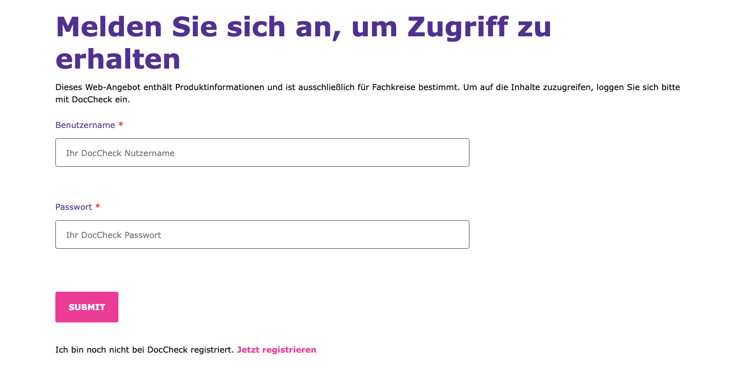
EDS Block: Contact Form
Uses the Contact Form block from the EDS UI Kit. The block supports text fields, password fields, and submit buttons. The form structure matches the login pattern.
| What editors do | Result |
|---|---|
| Create table | First row: "Contact Form". Each row = one field. |
| Add fields | Type: text | label: Benutzername | placeholder | required |
| Submit button | Type: submit | label: DocCheck Authentifizierung |
- Form fields (username, password, submit) map directly to the contact-form block
- DocCheck integration needed: Custom JavaScript to handle DocCheck API authentication, session management, and redirect after login
- Styling needed: Gradient header (navy → purple → pink) and card-like border from the original design need CSS customization
- Present on 4 of 11 pages — the main authentication gate for HCP content
form [newsletter] → contact-form
Match
Newsletter/updates signup form. Direct match to the EDS contact-form block.

fuer-updates-anmelden — form [newsletter]
Live page — Full signup form with text fields, email, country select, specialty radios, legal consent checkbox, and submit.
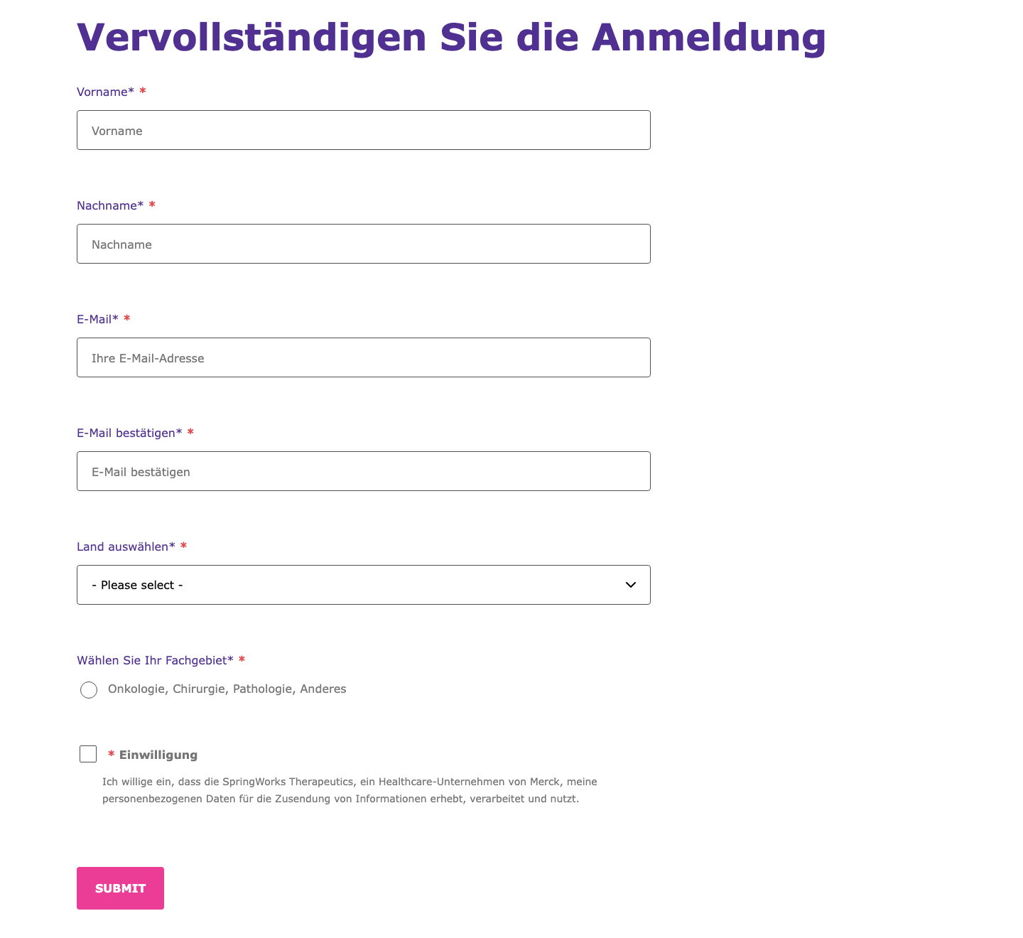
EDS Block: Contact Form
Direct match — the contact-form block supports all field types needed: text, email, select, radio, legal/consent checkbox, and submit. No custom development needed.
| What editors do | Result |
|---|---|
| Create table | First row: "Contact Form". Each row = one field. |
| Field types | text, email, select, radio, legal, submit — all supported natively |
| Validation | Add "required" in the config column for mandatory fields |
| Dropdown options | Comma-separated values in the options column |
- Direct match — all field types (text, email, select, radio, legal checkbox) are natively supported by the contact-form block
- Form submission endpoint needs configuration for the newsletter backend
- Present on 1 of 11 pages (fuer-updates-anmelden)
banner → custom block needed
Gap
Full-width promotional section with background image and floating card overlay. No existing EDS block matches this layout.

home (authenticated) — banner
Live page — Full-width background image (woman photo) with a floating white card overlay containing title, description, and redirect arrow.
No existing EDS block supports this layout
Why it's a gap:
The banner combines a full-width background image with a floating card overlay (white box with rounded corners, shadow, positioned left). This is a distinct layout pattern that no existing block handles:
| What's needed | Status |
|---|---|
| Background image | Hero block can do this, but not with a card overlay |
| Floating card | Not supported — needs custom CSS positioning |
| Arrow redirect | Standard link, but card-level click needs JS |
Recommended approach: Build a custom banner EDS block. Alternatively, author as a hero block with significant CSS customization for the card overlay layout.
- Present on 2 of 11 pages (home authenticated, dosierung-und-anwendung)
- Content atoms are simple (heading + text + link) — the complexity is in the visual layout
- Recommendation: Build as a custom EDS block for Phase 1, or simplify to a standard hero + CTA for initial launch
icon-grid → columns
Indirect
Row of icons with text labels. Maps to the EDS columns block with CSS adjustments.
dosierung-und-anwendung — icon-grid (5 items)
Live page — 5 icons with text labels about OGSIVEO dosing instructions. Icons are clickable on the live site (trigger overlay/popup).
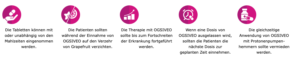
EDS Block: Columns
Uses the Columns block from the EDS UI Kit. Each column contains an icon image + text label. Layout renders side by side.
| What editors do | Result |
|---|---|
| Create table | First row: "Columns". One row with 5 cells (one per column). |
| Per column | Insert icon image + text paragraph in each cell |
- CSS fix needed for icon sizing — columns block renders images full-width by default, needs
max-width: 80pxoverride - Clickable icons not supported: The live site's icons trigger popups/overlays on click. The columns block does not support clickable items — this would need custom JavaScript or a different block approach
- Present on 3 of 11 pages
Gaps
Components with no matching EDS block — require custom development or content workarounds.
infographic → custom block needed
Gap
Complex data visualization panels with charts and statistics. No existing EDS block matches this pattern.

wirksamkeit-und-sicherheit — infographic
Live page — Patient demographics panel with donut charts showing percentages (23%, 77%, 50%, etc.), median age circle, and category labels.
No existing EDS block supports data visualizations
Why it's a gap:
Infographics combine interactive charts (donut/circular), dynamic percentage values, and complex multi-column layouts. This goes beyond what any standard EDS block can handle.
| What's needed | Status |
|---|---|
| Chart rendering | Not supported — needs SVG/Canvas or chart library |
| Data layout | Multi-column grid with mixed content types |
| Card styling | Bordered panel with rounded corners |
Recommended approach: Author as exported images (screenshot/SVG from design tool) for initial launch. Consider a custom infographic EDS block with structured data for Phase 2.
- Present on 1 of 11 pages (wirksamkeit-und-sicherheit) — 3 instances
- Contains patient demographics, PFS survival data, and safety summary charts
- Quick workaround: Export each infographic as an SVG/PNG and insert as a standard image in EDS
tabs → custom block needed
Gap
Tabbed content panels switching between data views. No tabs block in the EDS library.

wirksamkeit-und-sicherheit — tabs
Live page — Two-tab panel: "Primärer Endpunkt" (PFS data with Kaplan-Meier curve) and "Sekundäre Endpunkte" (ORR and PRO data).
No tabs block in the EDS library
Why it's a gap:
The EDS UI Kit does not include a tabs component. Tab panels require JavaScript to switch between content views while keeping the tab headers interactive.
| What's needed | Status |
|---|---|
| Tab headers | Clickable headers that switch content — not supported |
| Panel switching | Show/hide content panels — needs custom JS |
| Content per tab | Headings, images, text — standard content, just needs the tab container |
Recommended approach: Convert tab content to accordion (available block, same show/hide UX). Alternatively, build a custom tabs EDS block for a closer match to the original.
- Present on 1 of 11 pages (wirksamkeit-und-sicherheit)
- The accordion block provides the same expand/collapse functionality and is available out of the box — recommended alternative
- Content inside the tabs (headings, charts, text) is standard — only the tab navigation pattern is the gap